What NOT To Wear: Third Kit Edition
We are back once again to talk about outfits, because, well, we know our audience. Though our kit rankings are often controversial (still can’t believe how many of y’all didn’t like Portugal’s away jersey in the Euros but…there’s no accounting for taste I guess!), it’s also ESSENTIAL to analyze the fits and make wild predictions about how it will afffect performance! There’s a reason why I used to dress up for every exam I took: you respect the test folks! Also, ESPN also thinks this is newsworthy based on the CONSTANT alerts I received about kits in the past two weeks so yeah, it is real sport content ok!
This time, instead of picking our faves (and there are a LOT of good ones), we’re choosing to feature the flops. As you may have noticed, teams have their home and away jerseys, which have to be somewhat traditional, but they have this ~third kit situation where they sort of wild out. A lot of those third kits are pretty sick, and last year many of them made our list of best dressed, but this year, we have to confront the fact that things have gotten TOO CRAZY. There’s NO RULES and designers are out of control!!!!! So, welcome to the Worst Dressed list, a rundown of what NOT to do when making a third kit. And there are some doozies here, because covid has hit these jersey designers extra hard, and they lost ALL their taste this year.
DON’T: Make the sponsor the main character.
Puma thought they were real slick flipping the script with these kits and Thanks! I Hate it! I’m not mad about the inlaying of the club’s crest as a background pattern (although many others are) but the way we have reduced these teams to a single line of sans serif font is…not it for me.
Exception that proves the rule: The Ligue 1 Referees
We’ve said it before and we’ll say it again: We have absolutely no choice but to stan the Ligue 1 Referees bing sponsored by La Poste (the french postal service). HEROES!!!! Also, live love our favorite squirrely ref, she’s queen of gender equality. You may remember her from her star turn in the world cup in 2018!
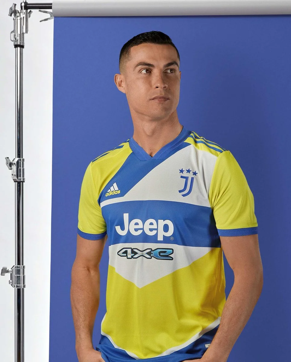
DON’T: Try to make your jersey into a Trig Lesson.
What…is happening here. Also poor model choice because Ronaldo LEFT THE CLUB. Rip! Maybe BECAUSE these uniforms are so ugly!!!! Who was like: let’s do yellow and blue, those aren’t even close to our colors, but I’m sure if we pick a hideous design and awful hues it’ll balance out!!! Get these shapes out of my face smh, I feel like I’m being asked to match the polygons in math class with those clear plastic thingys Anyone? no?
Exception that proves the rule: Venezia FC
I mean, it’s HYPNOTIC. I am into it. The Colors/ombre is fun, and while I generally don’t support Kappa kits because their logo is trash (its 2021, why is your logo a sexy sillouette? Come on fam), I am a fan of what’s going on here, and I appreciate the Venezia font.
DON’T: Get lost in 90’s Nostalgia.
Listen, we all miss the 90’s (I mean, I was like 2, but sure, I get it) (the youth!! She doesn’t get it folks - Katrina). I understand that it’s trendy and cool to glorify the past. But you know what’s not cool? These kits. They’re cringe. They’re- dare I say it- cheugy. EVeryone wants to relive their glory days Man United, but maybe you should go reread the Great Gatsby and think about the past in a different way, okay?
Exception that proves the rule: Arsenal’s 90s Tribute
I love this, it reminds me of those fun 90s cups, that is all, I will not elaborate.
DON’T: Buy your Kits at Dan Flashes
I mean, is this a soccer jersey or are you trying to emulate the strobe lights of an Ibiza Club? (pronounced iibtha) Where are we? Why is sandstorm playing?!?! The patterns are TOO COMPLICATED. The spurs one looks like the sheet of paper your printer spits out once you’ve replaced the ink!
Exception that proves the rule: Spurs Away Kit
I mean, don't get me wrong, this is STILL a lot, but it’s giving me Van Gogh Immersive exhibit and I am feeling it. the culture! It’s very galaxy esque as well, which is beautifully optimistic for a team that seems smaller each year.
DON’T: Channel the Legends of Jersey Shore.
You are a professional soccer player, not Pauly D headed to the club (CABS A HERE) in the year of our lord 2010- I know, it’s confusing sometimes. You do not need to wear snakeskin to get attention.
Repeat after me: You are not a snake. (well, you are, as a man, a snake, but still, no need to reinforce the image)
The Exception that Proves the rule: Inter Milan AWAY Jersey
TBH Idk what’s going on here but I am into it and I would wear this with a thick gold chain. I can’t explain why this is better to me than the home jersey. I’m sorry. Also I like that is says SINter. Get it? Like the snake? in the garden of eden? Original sin- hits every time.


